

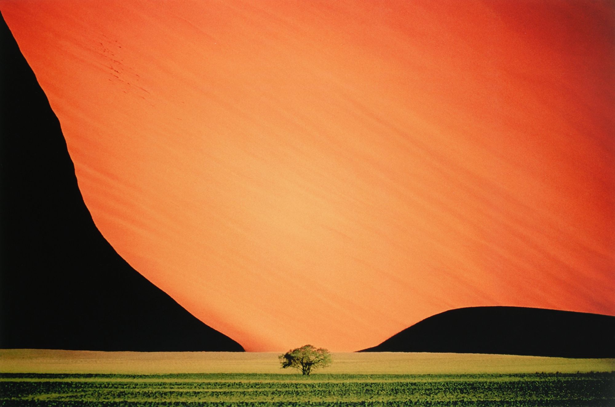
I've always heard of Pete Turner and his impact on color photography. I'm not sure why, but recently his name randomly popped up in my head and I realized I don't actually know any of his work other than his iconic "Sand Dune and Tree" (which is copied to death at this point). I only knew the name. I did some quick searches and realized his stuff is far more than just that one photo. I really enjoy looking at his photos - they're incredibly unique, mysterious, and thought-provoking.
When you see a photo by Pete Turner, you know it's by Pete Turner. Throughout his career, he's done a lot of work around album art and movie posters. Traces of his aesthetic can be seen in many vaporware and futuristically styled artworks. Unlike the majority of photographers throughout history who try to capture the world, Pete Turner photos don't try to depict reality and our world as we know it. His photographs often have familiar elements presented in an unfamiliar way, pushing the boundaries between reality and imagination. It's so stark that I've been inspired to write this post to further help study his work.
Whether or not you're a fan of his work, I think there's a lot we can learn from him. By analyzing his work, we can learn how a photographer can develop their own unique style and how their techniques can elicit specific types of feelings. Turner has a very distinguishable way of using color, black, simple shapes, and post-processing which I'll dissect in this post. With these techniques, he's able to alter reality, create illusions, and expand our imagination. Similar to the Michael Kenna post I wrote, I'll first describe the techniques Turner uses and then go through concrete examples.
Disclaimer: I couldn't find many of Pete Turner's photos online but thankfully I have his book and took photos of his photos which are used in this post. If I'm infringing on copyright, please contact me and I'll take it down - my intent is not to profit but rather to learn. For those interested, the book I own is Pete Turner: Photographs.
Color
Pete Turner is known for his color photography and he has a very distinguishable way of using colors that makes his style extremely recognizable. He often uses color to break our associations with the subject and create a feeling of foreignness.
First of all, in terms of choice of colors, Turner pretty much only works with the primary colors - red, green, blue, yellow. Most of the time his subjects don't exist in those colors, but Turner would color correct the composition to fit those colors. Regardless of what colors are present in the photo, the palette is always limited. I find his photos generally have a maximum 3 color tones.
On top of the small variety of colors used, the colors themselves are very pure and have minimum to none hue deviation. What I mean by that is when Turner uses red, he will literally only use one hue of red with no mixing of other colors. Consequently, there are minimal color gradients in Turner's photos - most of the gradients transition between different luminosities. It also means the colors generally tend to very blocky due to the lack of variation.
Lastly, his photos are all edited to be high in saturation. This one is self-explanatory and I won't go in more detail.
Black
Many of Pete Turner's iconic works utilize lots of blacks - some of these photos have black taking up over 50% of the frame. For the majority of the time, the black parts of the photo are not black in real life but are intentionally edited to be black to reduce the noise in the photo. Black also invokes the feeling of mystery and unknown, which is why I believe Pete Turner heavily utilizes blacks. Coincidentally, having large parts of the image black to make compositing easier (it's basically like a green screen), which will be discussed later in the blog post.
Geometric Shapes
Pete Turner's photos often have strong geometric elements. Unlike Michael Kenna whose shapes are often implied through objects, Turner's shapes are more graphic and abstract. Objects are stripped down to their basic shapes through editing and the rest of the frame also minimally hints the setting of these objects. Thus it's often very difficult to tell what the object that's creating the shape actually is. Similar to Turner's limited choice of colors, his choice of shapes are generally limited to simple shapes such as triangles, circles, and rectangles.
Post Processing
As we can already see from the examples mentioned, Turner heavily edits his photos to convey his ideas clearly. I've briefly mentioned a few things he does such as color alternation and blackening out details to keep the composition lean and simple.
In addition to those techniques, Pete Turner experiments a lot with composites. A composite is a photo made up of multiple exposures put together. We see a lot of this nowadays on Instagram where people would photoshop the galaxy into the sky for a landscape photo. However, Pete Turner's choice of photos and subjects to composite together is very unconventional and unintuitive, which I find quite creative.
Examples
Now, let's look at some more photos by Turner and dissect them in depth. Interestingly, Michael Kenna and Pete Turner demonstrate similar techniques in post-processing and they both have strong geometric elements in their work. Both artists' compositions are minimalistic in nature, yet they elicit completely different emotional responses. While Kenna's photos make people feel peace and serenity, Turner's photos have more energy and create a feeling of mystique, exploration, and adventure.
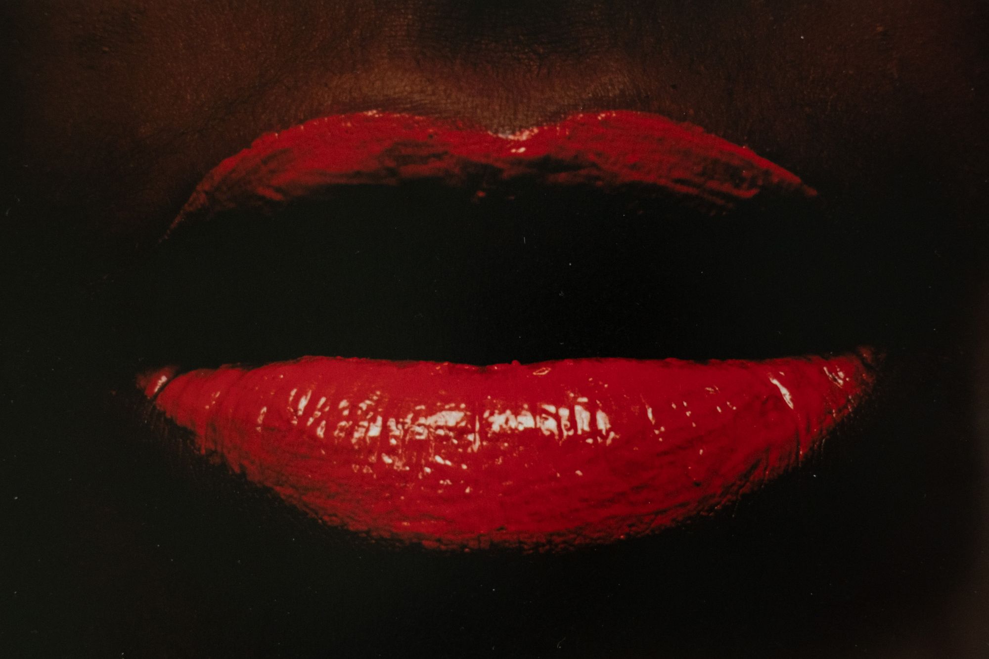
In this photo, I find the subject barbaric and savage, making it uncomfortable to look at. Traditionally, makeup and lipsticks are used to beautify people, and photos of makeup generally showcase the positive effects of makeup. Here, Turner did the complete opposite and titled it "Hot Lips".
The lips look unprofessionally painted with a powerful saturated red, which creates an aggressive and hostile mood. I don't think another color could've produced as much impact this red. A harsh point source light was used to emphasize the texture on the lips. Contrasted against the black background, the texture of the lips become even more prominent, accentuating the imperfections of the application of the makeup.
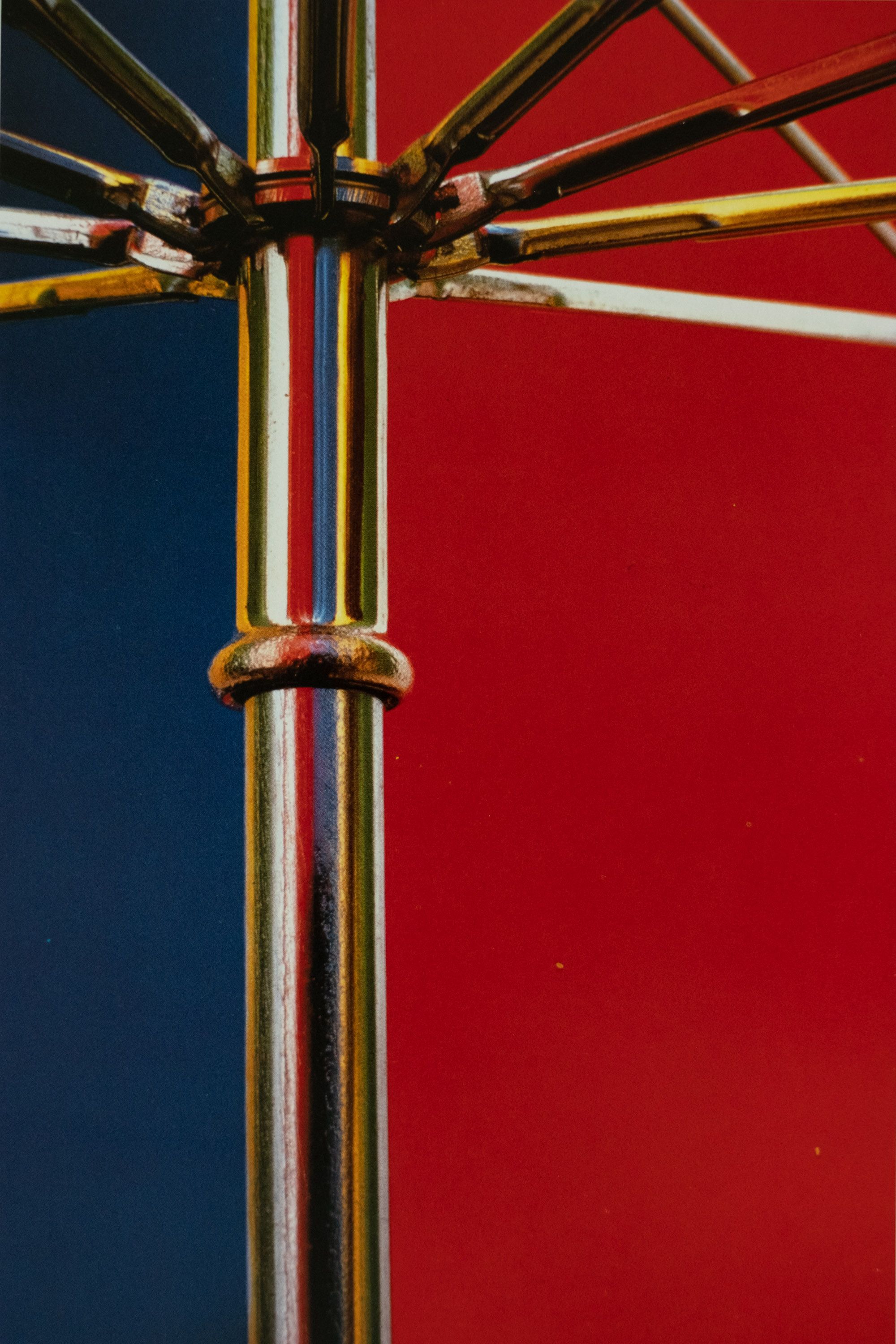
I don't think there is much meaning to these photos other than abstract color blocks, but I do find them to be an incredibly aesthetic. These utilize primary colors which make the composition feel energetic. I really love what Turner did in "Umbrella" with his creative and unconventional use of reflections. It's inspired me to also play around with reflective surfaces of different shapes.
I'm sure Piet Mondrian was a big inspiration for Pete Turner. From afar, these photos (especially "Umbrella") look like color blocks that seem to resemble Piet Mondrian color-blocking - straight lines and primary colors. Similar to Mondrian, Turner's use of color here is pure and thus make these abstract compositions feel divorced from reality.
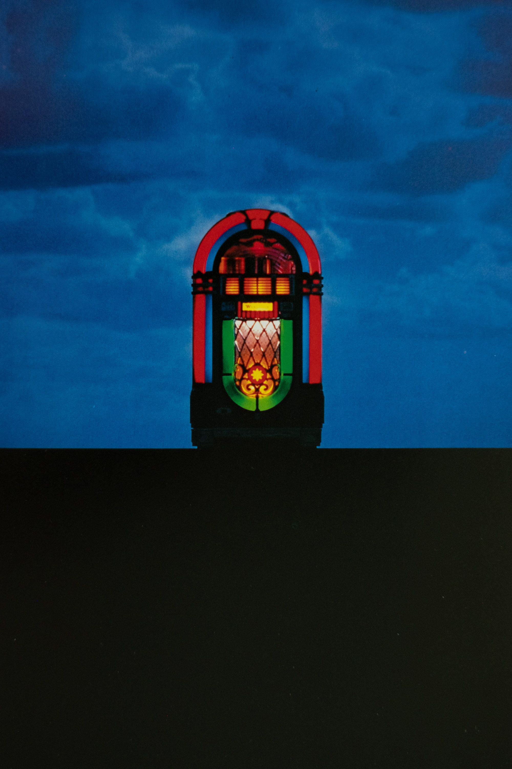
In this piece, a jukebox is taken out of its normal environment and placed in what seems to be the middle of nowhere. The surface the jukebox sits on is perfectly straight and completely black (I assume done through editing), with the black taking up almost half the frame. This makes the perspective of the entire photo very confusing - is this jukebox placed on a flat surface, or this black surface and elevated object. Again, the colors here are pure red, green, blue, yellow with minimal hue variation which feels quite very artificial. Although the jukebox's colored lights are clearly illuminated, there is no power source to be found. Altogether, the composition feels bizarre and seems to be a nod to the surrealism movement.
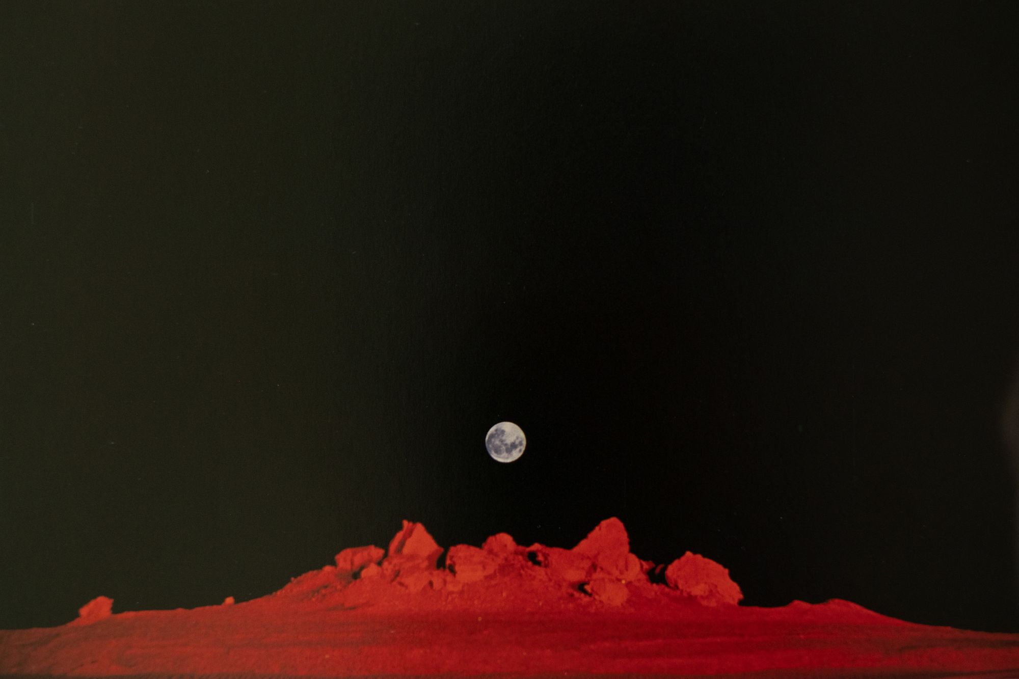
Our perception of reality is once again challenged in this piece - this composition feels like it was taken on some other extraterrestrial body. The sky is pure black with no visible stars and the barren landscape is a saturated red, which defy our understanding of sceneries on Earth. Additionally, the shadows on the rocks hint that there's a powerful point light source somewhere on the right side of the photographer, further enhancing the feeling of outer space.
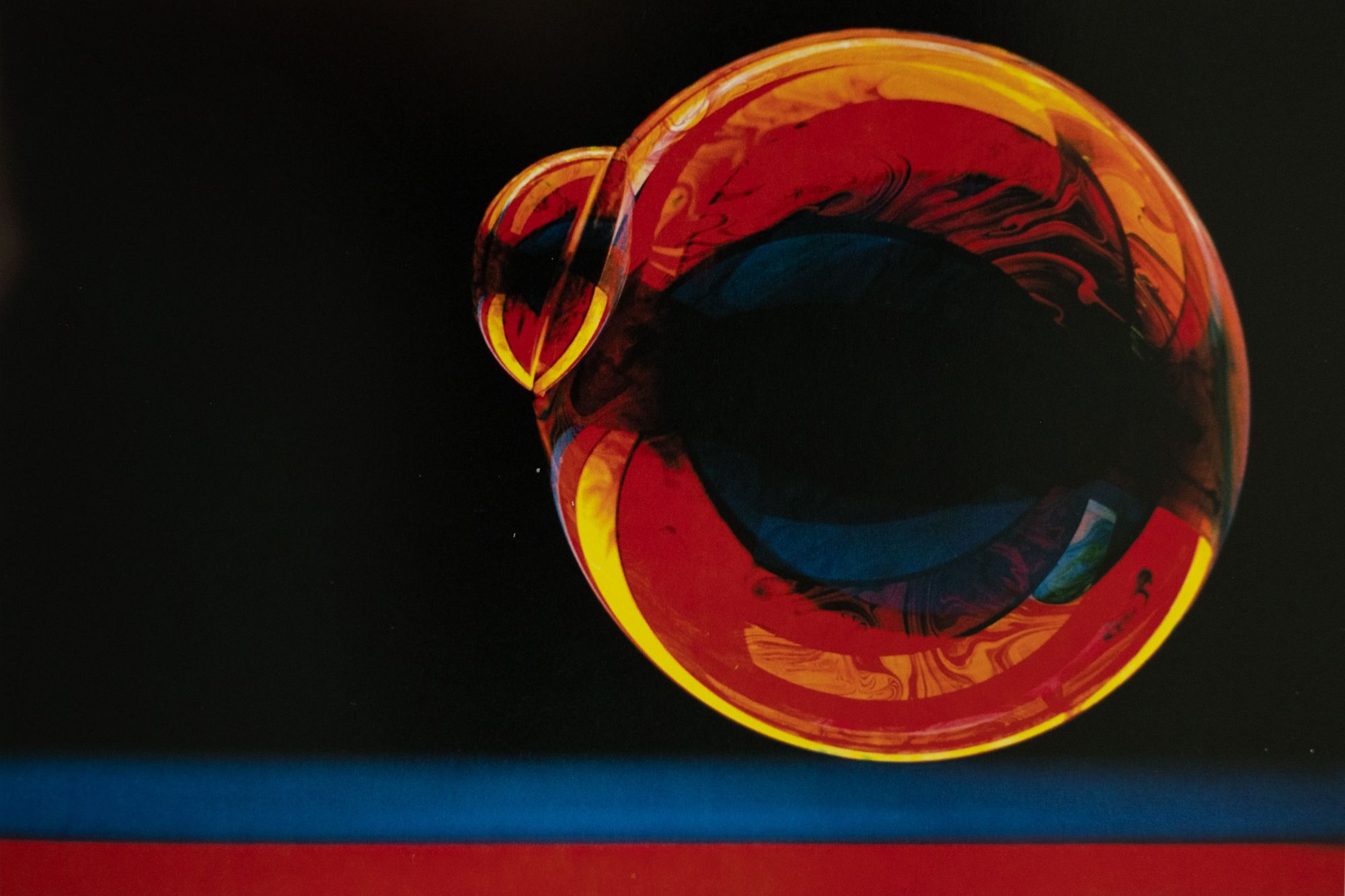
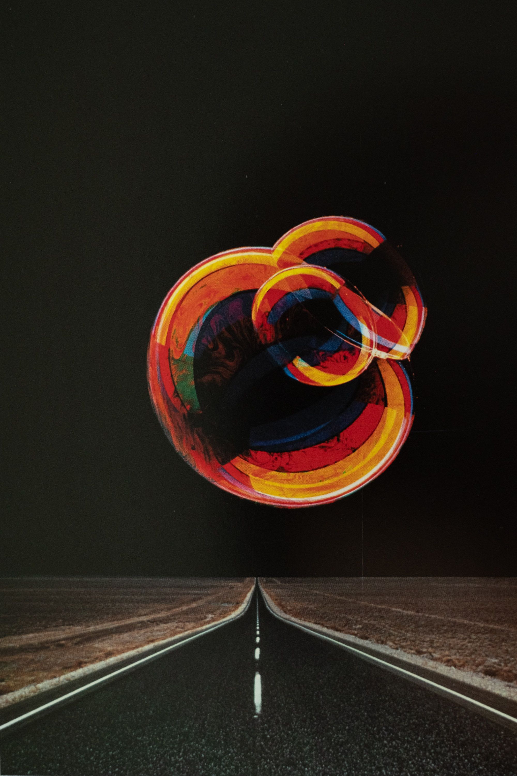
At this point, we can see a pretty consistent pattern of color and black utilization that I've mentioned in the beginning. Though the left one is a simple study on bubbles, it's interesting how Turner set up the shot such that the only colors visible on the bubbles are yellow, red, and blue. Normally, you would expect the bubbles to be more rainbow-colored. These simple bubbles are then taken out of its normal context and composited into a scene with an empty road where the sky is post-processed to be pure black. The end result is a totally surreal dreamscape.
I believe Turner likes to explore the idea of infinity and continuity in his photos. Many of his compositions either have a clear vanishing point - like the one on the right - or there's a lack of absolute perspective - like the one on the left. It feels like the scene is either going on forever or is just a tiny slice of a huge world. Though not as obvious, we also see this idea in previously discussed photos.
There are various ways to achieve this such as using different focal lengths and changing the subject distance. In general, these perspectives can't be easily observed with our eyes on a normal day and doesn't feel "present". Thus, seeing photos in these perspectives give us a sense of foreignness. Especially when opposites are combined, such as the right one when a bubble shot with a long focal length is composited with a road shot ultra-wide. We'll continue to see this in more photos that we analyze.
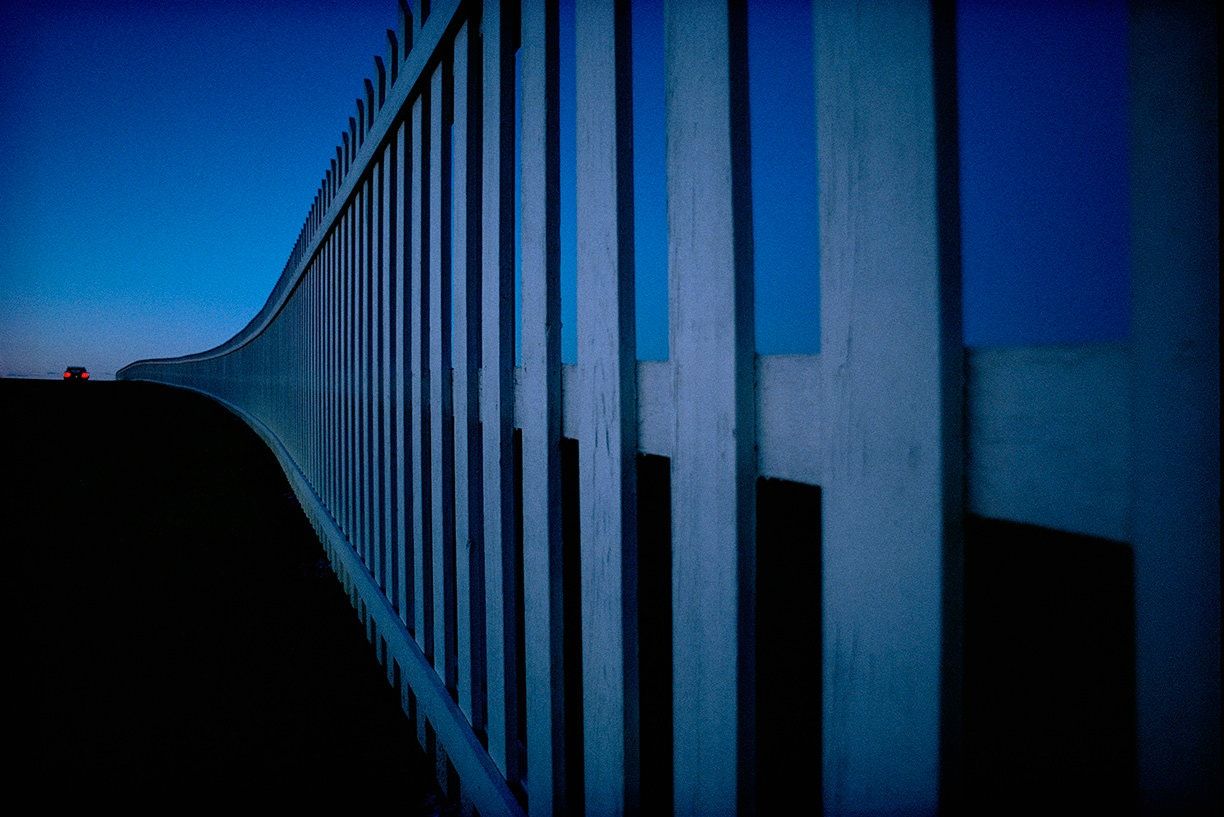
"Road Song" is one of my favorite photos by Pete Turner. The composition masterfully creates a sense of mystery through the techniques mentioned. Turner utilizes a primarily simple and pure color palette consisting of blue with a small splash of red near the edge of the frame. The entire ground is shrouded in a black, creating a sense of mystery and generating curiosity for the viewer. The fence extends from one edge of the frame to the other edge, defining the horizon and splitting the black ground and the blue sky. It brings focus to the main subject, the small car in the distance, and almost feels like it continues to extend beyond the photo. There's nothing redundant in this photo and every element plays its part in creating the mood of this photo.
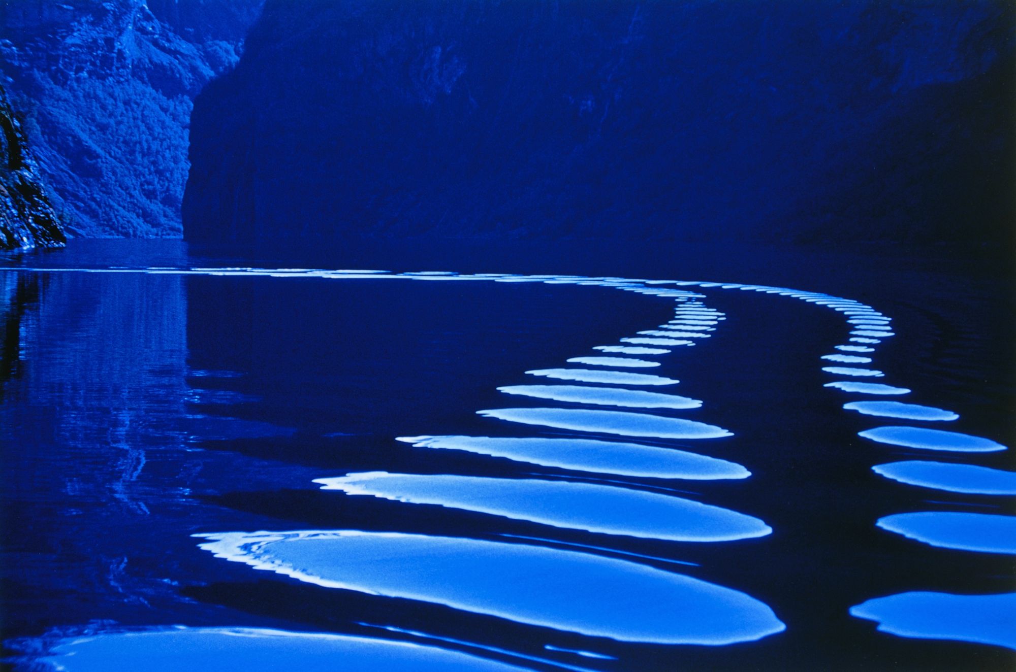
The second photo utilizes similar compositional and editing techniques, except in this one there's a strong focus on repetition and shape.
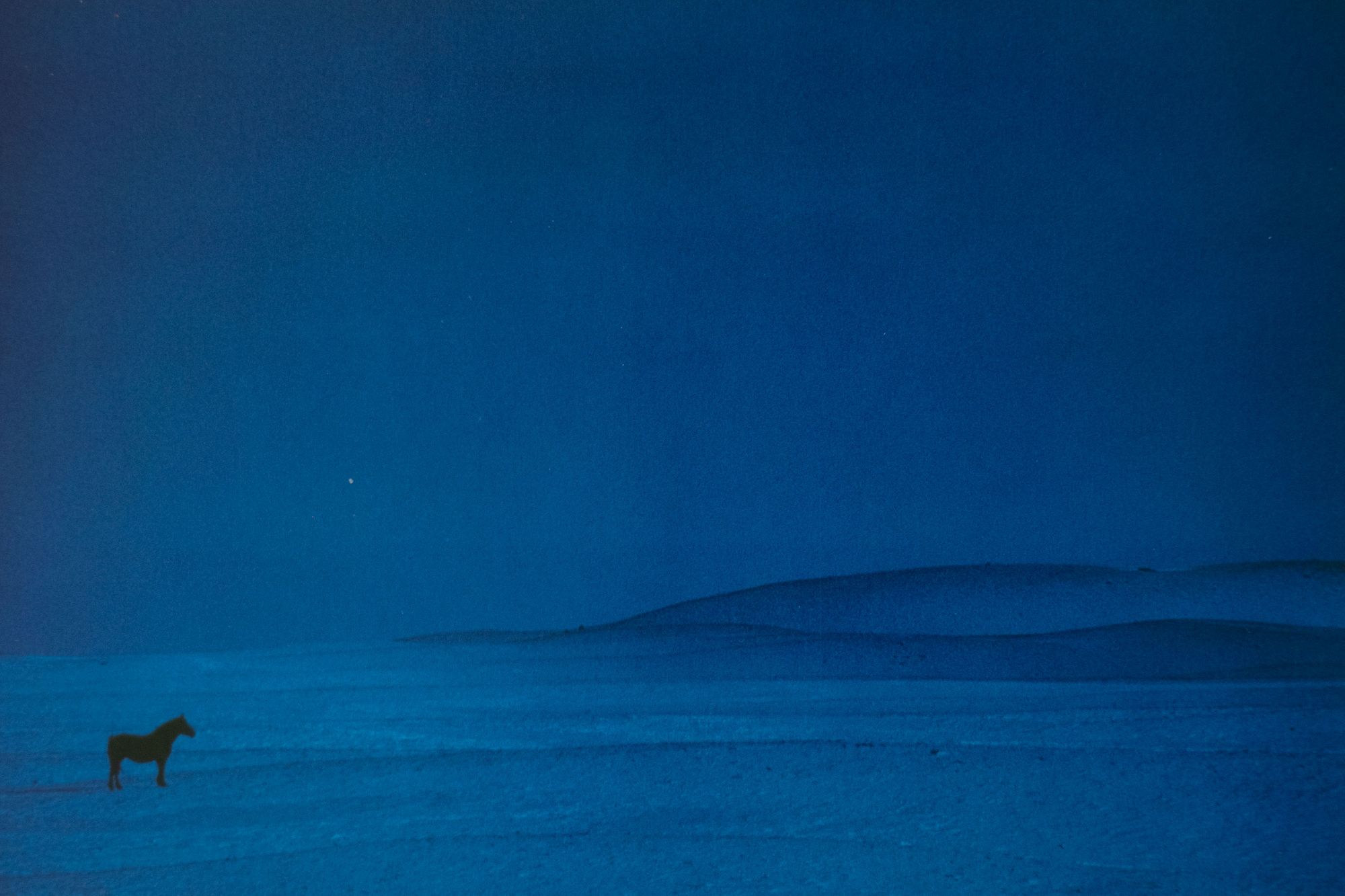
Pete Turner explained that this shot was taken during an overcast day and the mood felt blue, so he slapped on a blue filter and made the entire composition blue. The lone black silhouette of a horse in a barren landscape indeed feels very sad and lonely.
I notice Turner's compositions are quite minimalistic and often like to place a single subject in an empty scene, usually with strong use of blacks. This creates a sense of isolation, which can be observed in many of the previous photos such as "Road Song", "Jukebox", "Future Road". Interestingly, most of the times the isolation doesn't necessarily feel sad. For those other ones, it's more feeling of the unknown and the foreign, which can be interpreted differently between people.
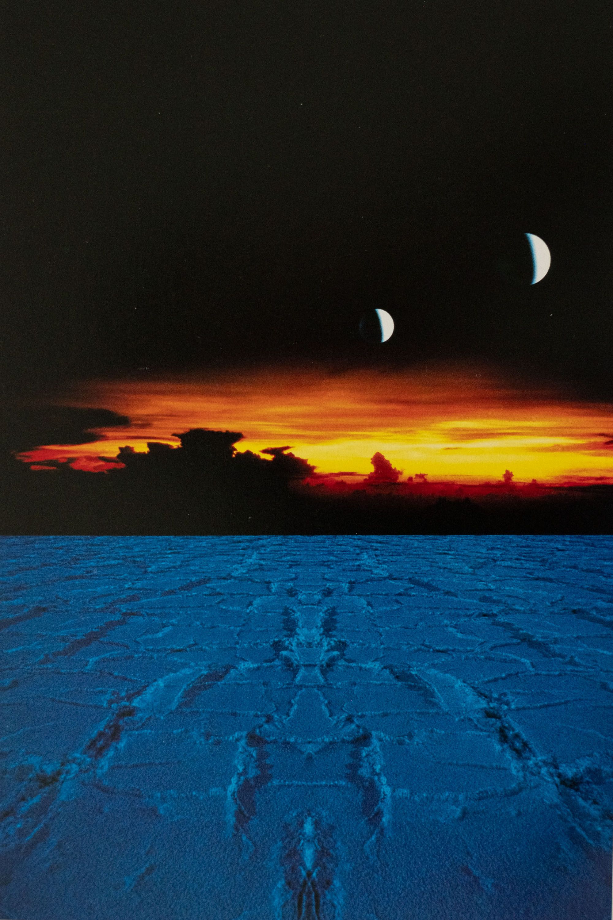
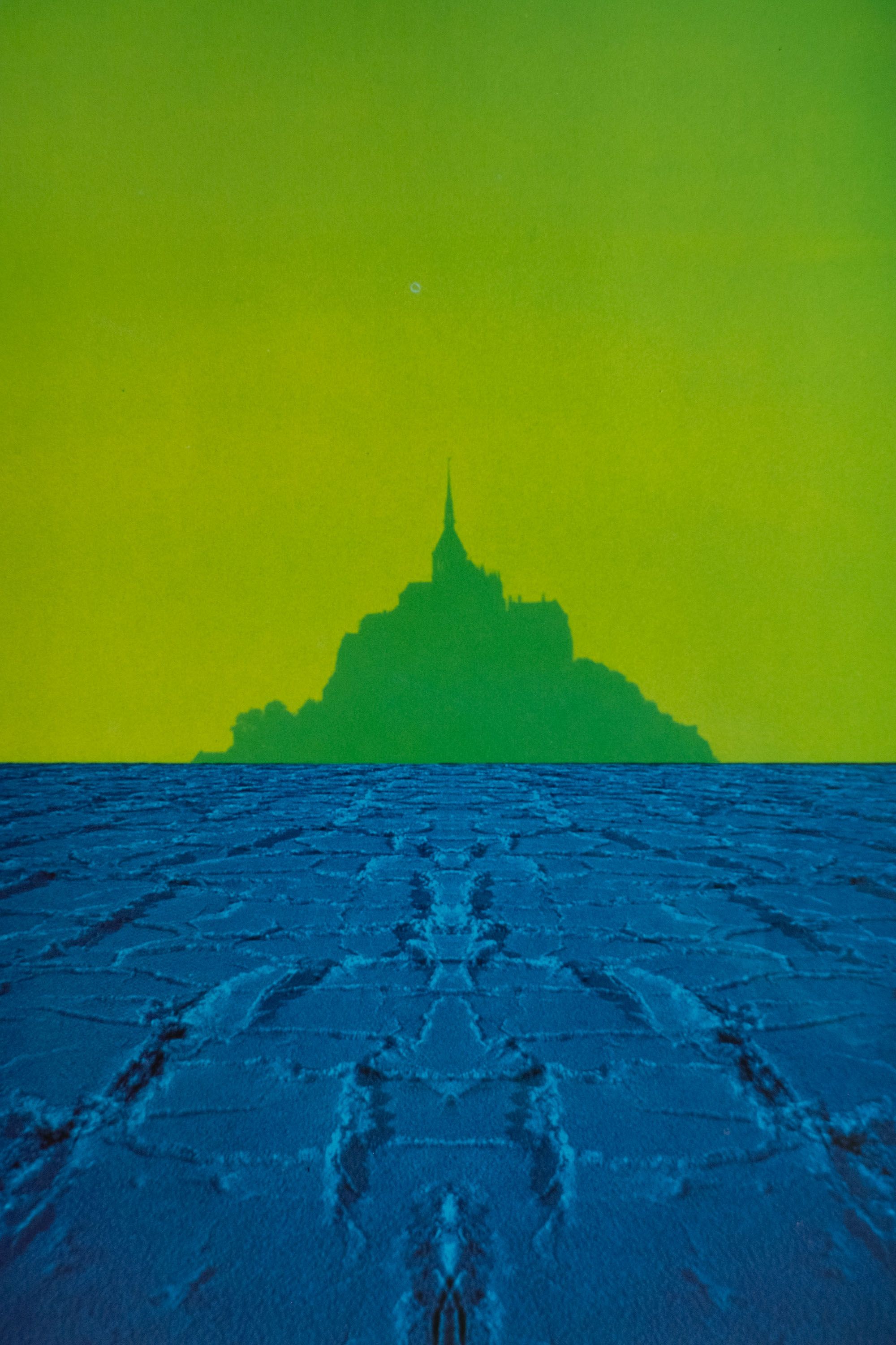
Turner calls these series "The Plains of Forever". In these photos, he took various landscape photos plus studio elements and composited them together. I find it super creative that Turner combines studio elements with location photos. Usually, composites are made with photos only in studio or only on location, rarely together. These photos challenge me to think outside of the box to create photos that are never seen before. They're almost like magic tricks, leaving viewers in wonder and curiosity.
The choice of color, blacks, and post-processing should be no surprise at this point. All three photos utilize simple colors and are unified together with the blue "plain". Blue is not usually what we'd associated ground with and neither is green what we normally associated Mont St. Michel with. Though it feels foreign, turner doesn't totally throw us into the unknown as the subject is still fundamentally familiar.
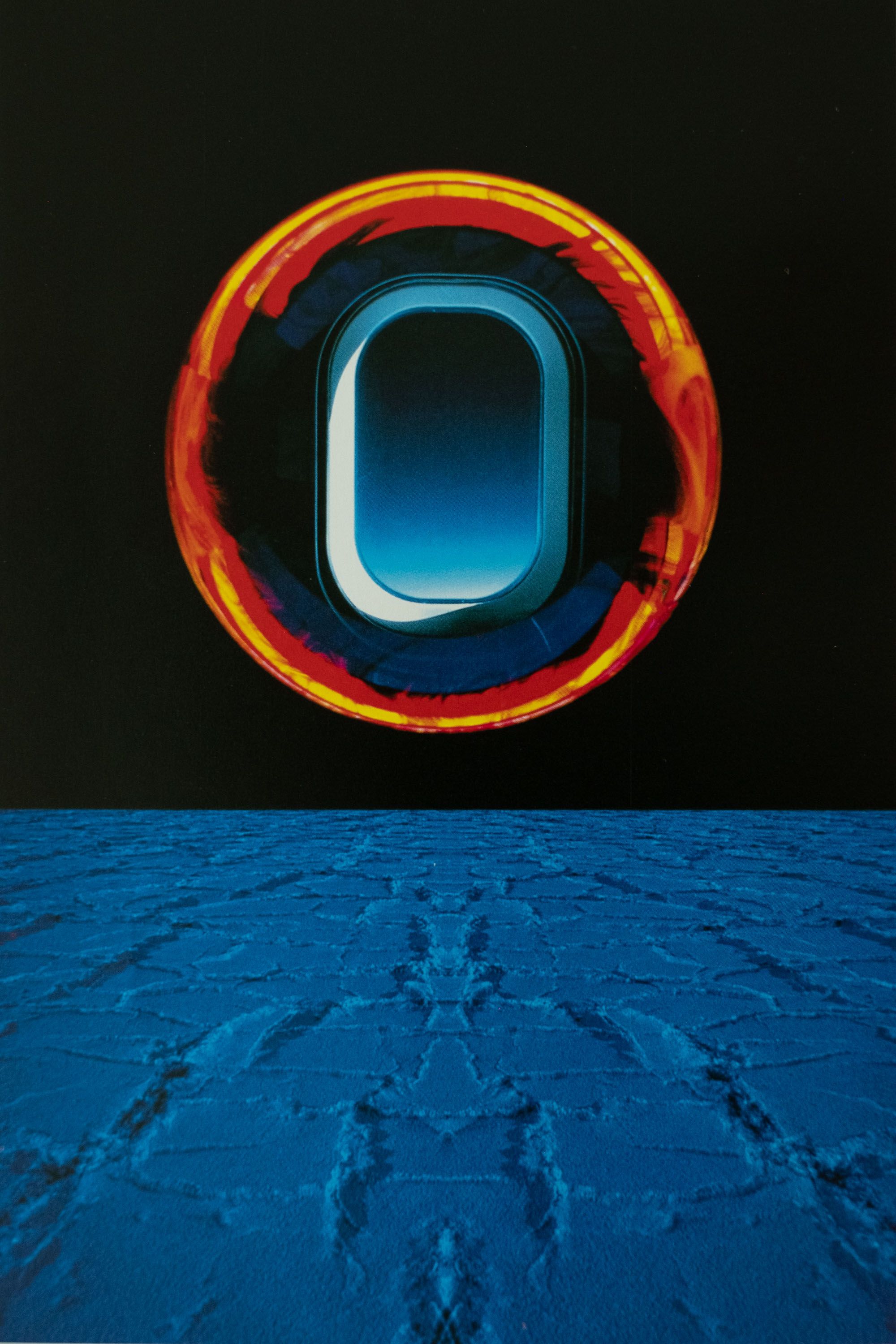
Turner mentions in his book that the fort that "Cannonball" was shot in is actually white. Instead of shooting the fort in its original color, he decided to utilize the white as a blank canvas to make the entire composition uniformly blue. In the dead center, there's a cannonball that's perfectly round and it looks like someone drew a black circle in the middle of the photo. But hints of the diffused shadow give it away that the circle is indeed an object. The roundness of the cannonball also contrasts really well with the straight edges of the fort.
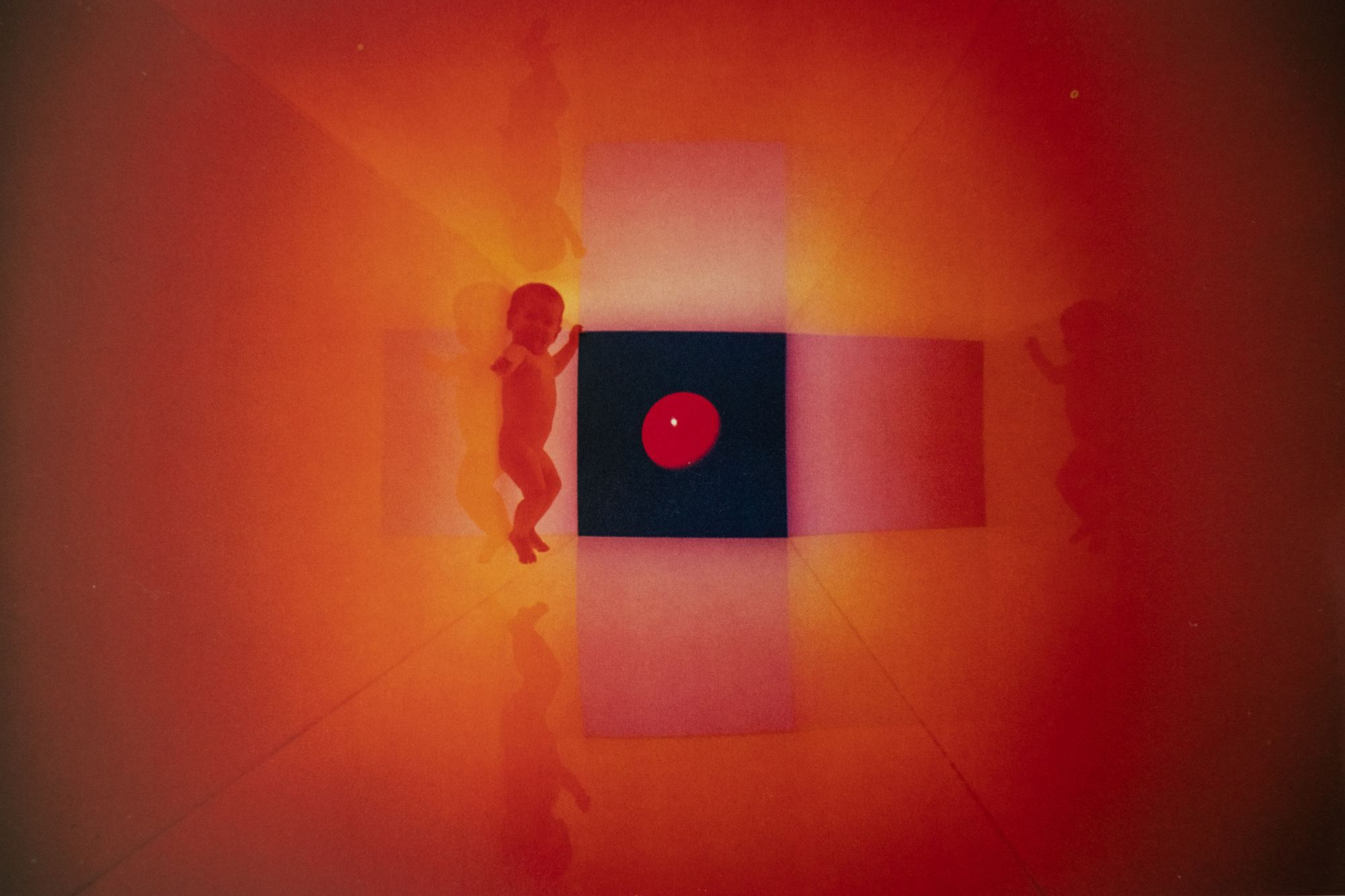
Similar compositional techniques utilizing shapes can be seen in "Baby in the Cube". A monochromatic red is used for the entire composition and the softness of baby and sphere contrasts beautifully with the straight edges of the cube. This composition makes it feel as if we're looking at a planet through the window of a baby's play space in a space ship. You can also tell this is a composite photo because the sphere is projecting no reflection inside the cube, which adds to the surrealism.
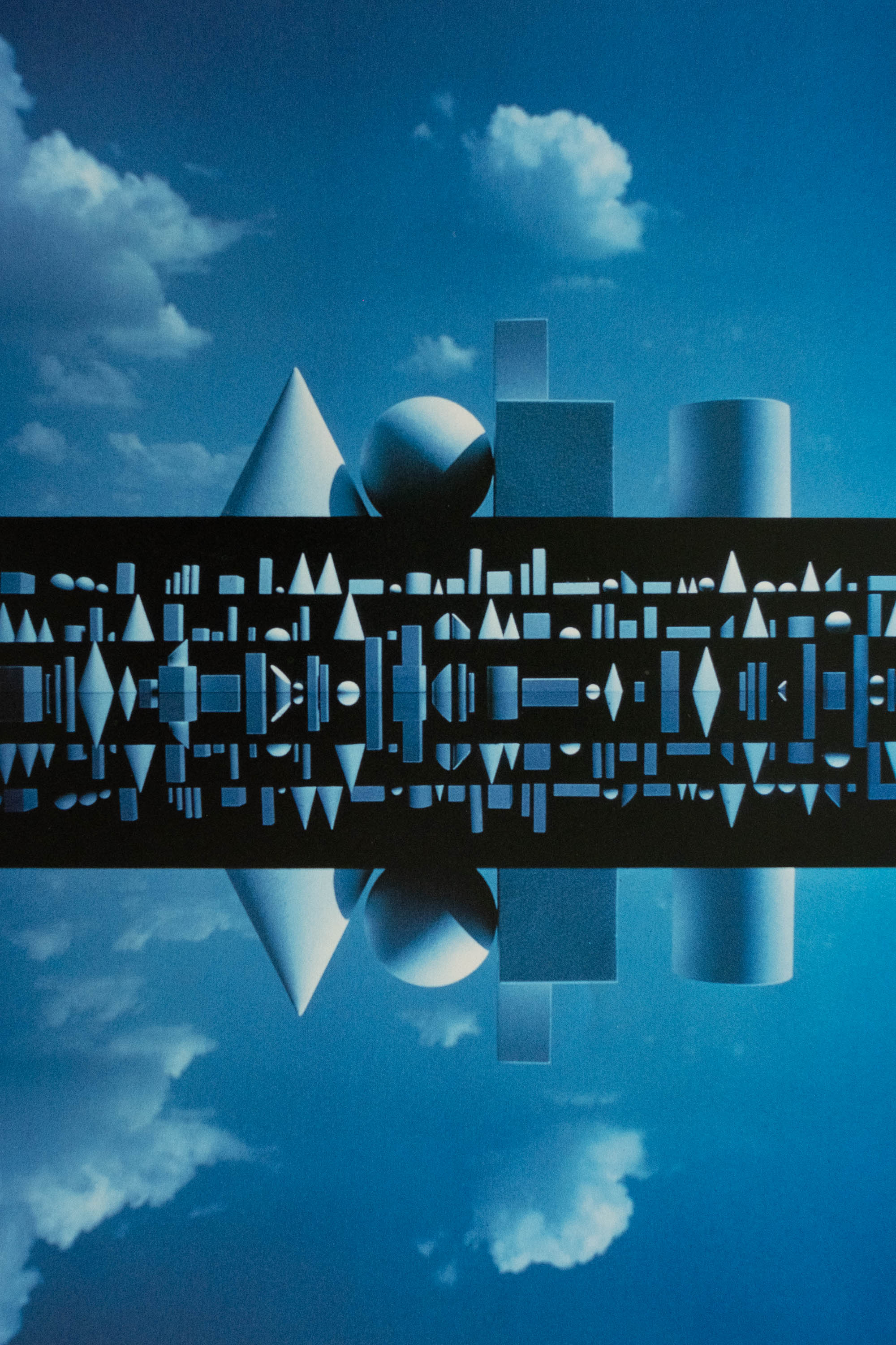
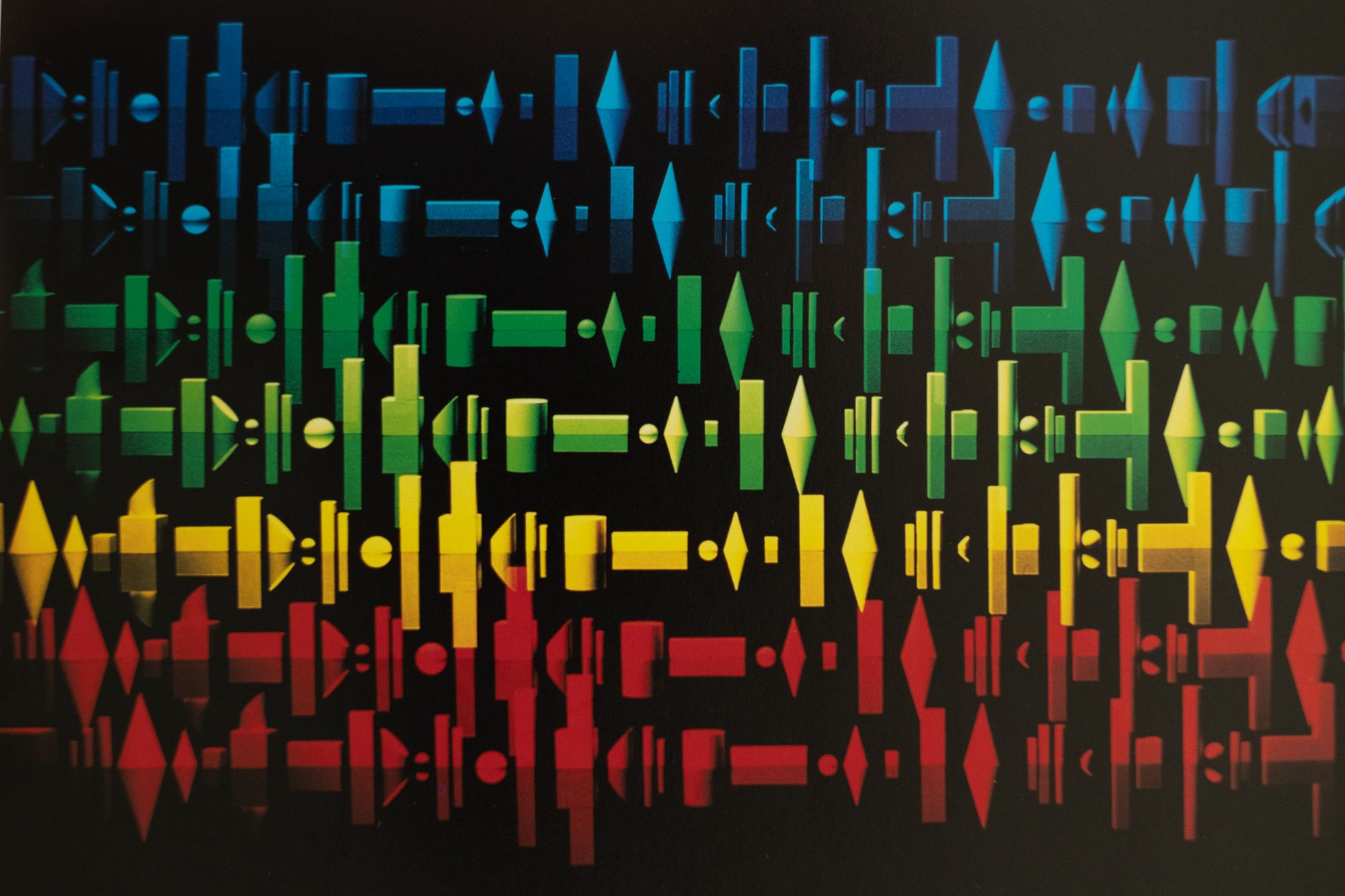
I would like to end the post with an analysis of these two photos. It's been evident Turner likes to use shapes in his compositions, but in these two the entire compositions are just shapes. In a sense, I feel like these compositions are the literally most minimalistic representations of Turner's style because of the colors, shapes, blacks, and post-processing.
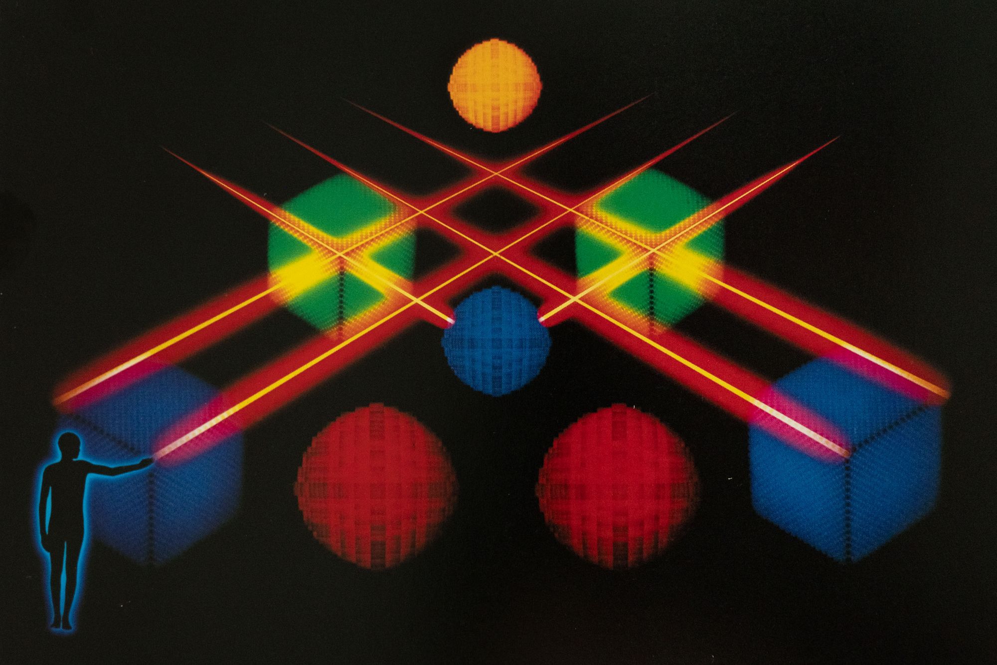
These photos are quite abstract and it's difficult to tell the size of the shapes and how the shapes exist in a physical space. Especially in "Shapes of Things to Come 1", the size of the bigger shapes in the first row get accentuated when they are contrasted with the smaller shapes. To Turner, this photo is supposed to represent futuristic cities. For the second one, there's a similar play on perspective where the viewer can't tell whether the shapes are on the same horizontal plane or vertical plane. Turner describes the last photo as a technical feat that was done in camera.
Conclusion
I hope looking through Pete Turner's examples gives you an understanding on how he achieves his unique style and how you can also utilize his techniques to bring his ideas into your own photography. In general, the key takeaways are:
- Have intentional use of color (ie, color choice, color gradients)
- Blacks can be used to simplify the composition and create mystery
- Multi exposure composites can open up a new world of photos
- Use the above techniques to break people's expectations of the world
Like I said before, the best way to get better is practicing with intent, so go out there and try it out!


